Client: PayPal
Agency: R/GA
Role: Product Design, Visual Design
Year: 2025
Agency: R/GA
Role: Product Design, Visual Design
Year: 2025
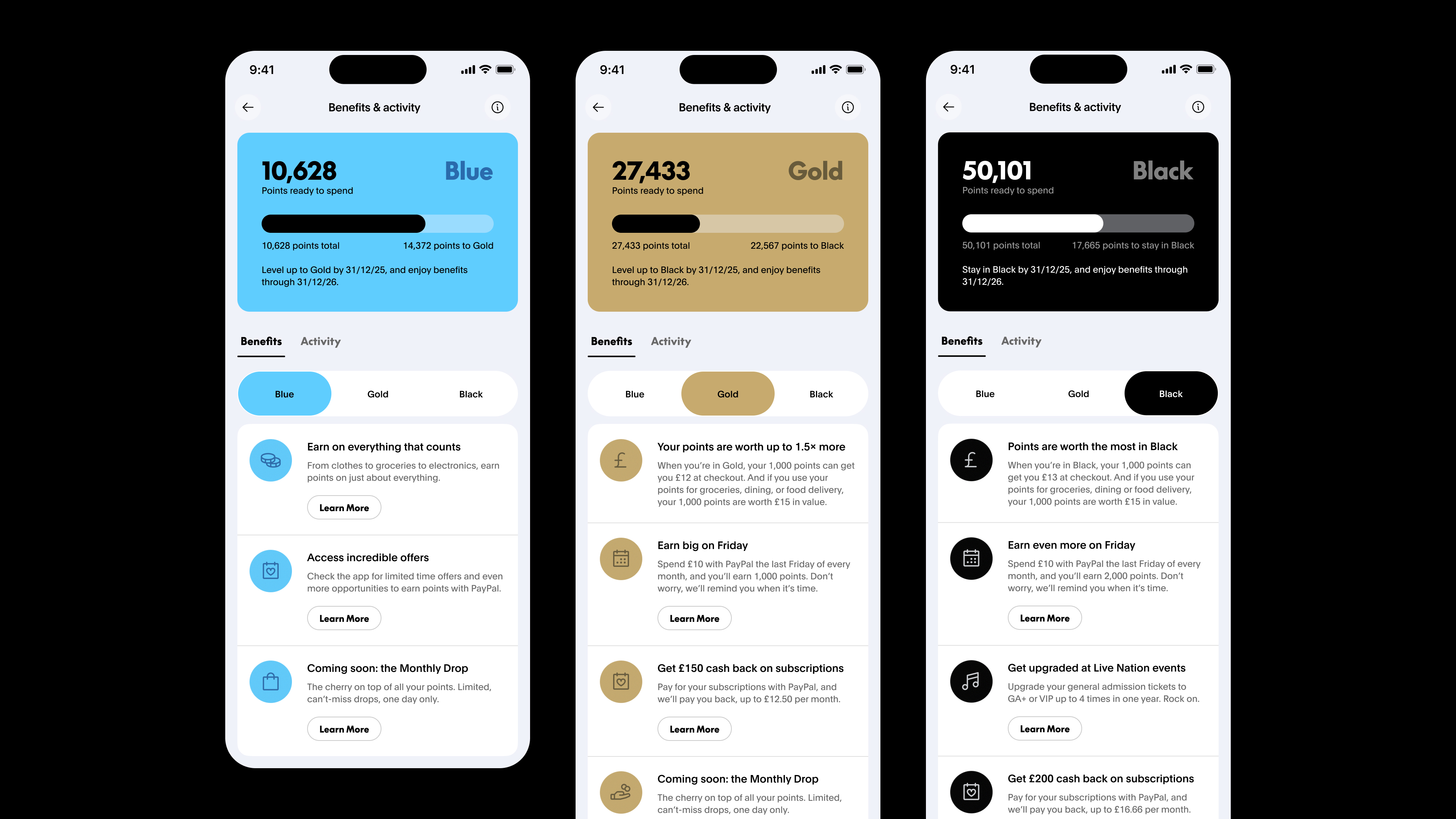
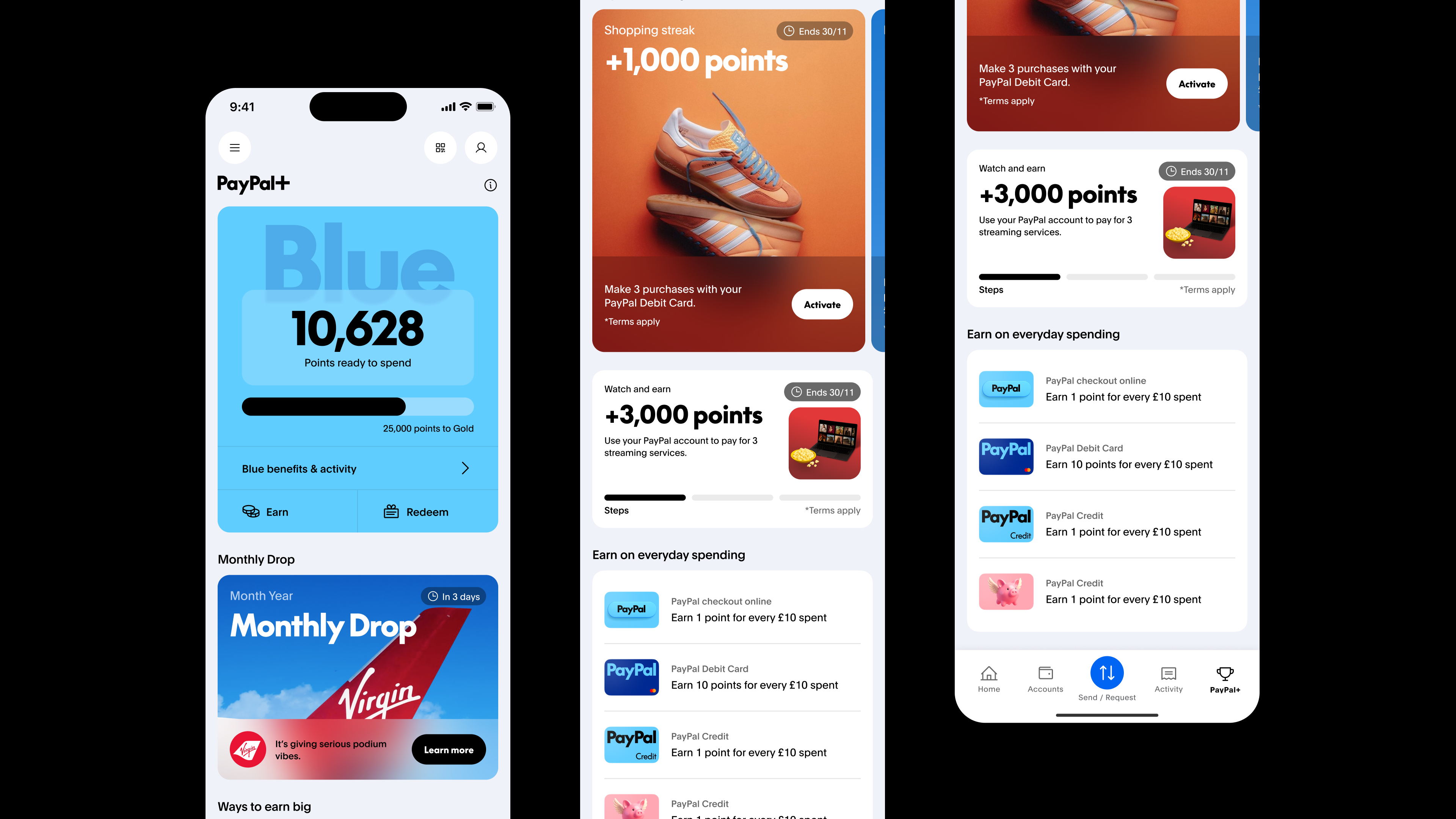
PayPal partnered with R/GA to evolve its app from a transactional utility into an intelligent, trusted financial partner. Instead of adding features, this project reset the entire app experience with a unified, modernized design system that aimed to form new habits and create real value for users. My focus was leading design on the Rewards Stream—a tiered loyalty program with a bold visual identity, progress tracking, and “Monthly Drop” offers that reward engagement.
Problem
The existing rewards offering lacked:- Clarity: Users struggled to understand point values and benefits.
- Motivation: Rewards felt static, and tier progression wasn’t communicated well.
- Brand alignment: The experience didn’t reflect PayPal’s ambition to be a financial partner.
Aims
- Make rewards intuitive, dynamic, and fun.
- Provide clear progress tracking and engaging milestones.
- Reinforce trust with a cohesive design system across tiers and offers.
Research Insights
Through user testing and stakeholder workshops, we uncovered key drivers:- Progress visuals motivate users. Progress bars and milestone nudges encouraged engagement.
- Clarity reduces friction. Simple conversions from points to value eliminated confusion.
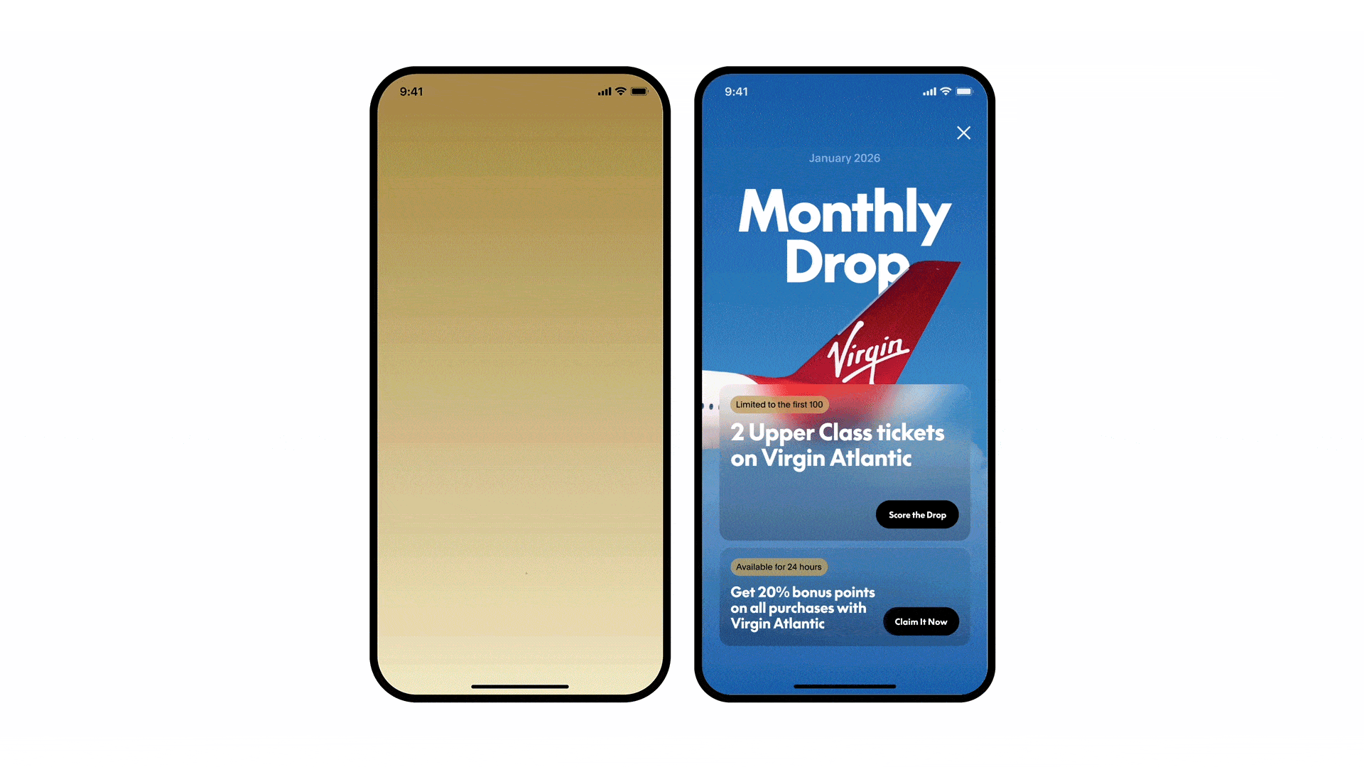
- Exclusive experiences excite users. Offers like concert tickets and VIP deals elevated PayPal’s perceived value.
Design Process
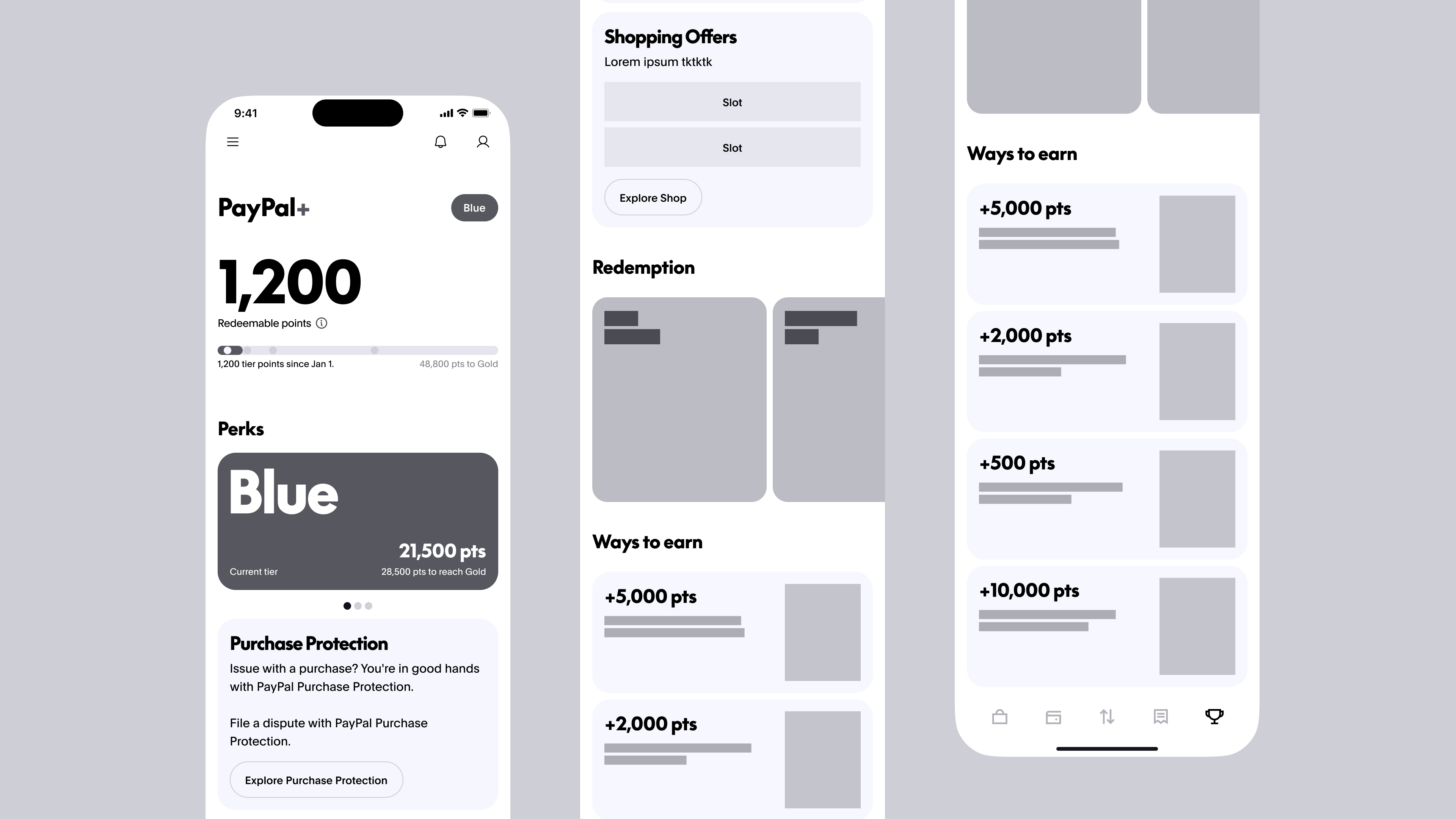
1. Wireframes & Information ArchitectureWe began with low-fidelity wireframes to map a clear structure:
- L1 (Landing Page): Quick access to points overview, tier status, nudges, earning options, and redemption categories.
-
L2 (Details): Deep dives into milestones, benefits, and activity history.
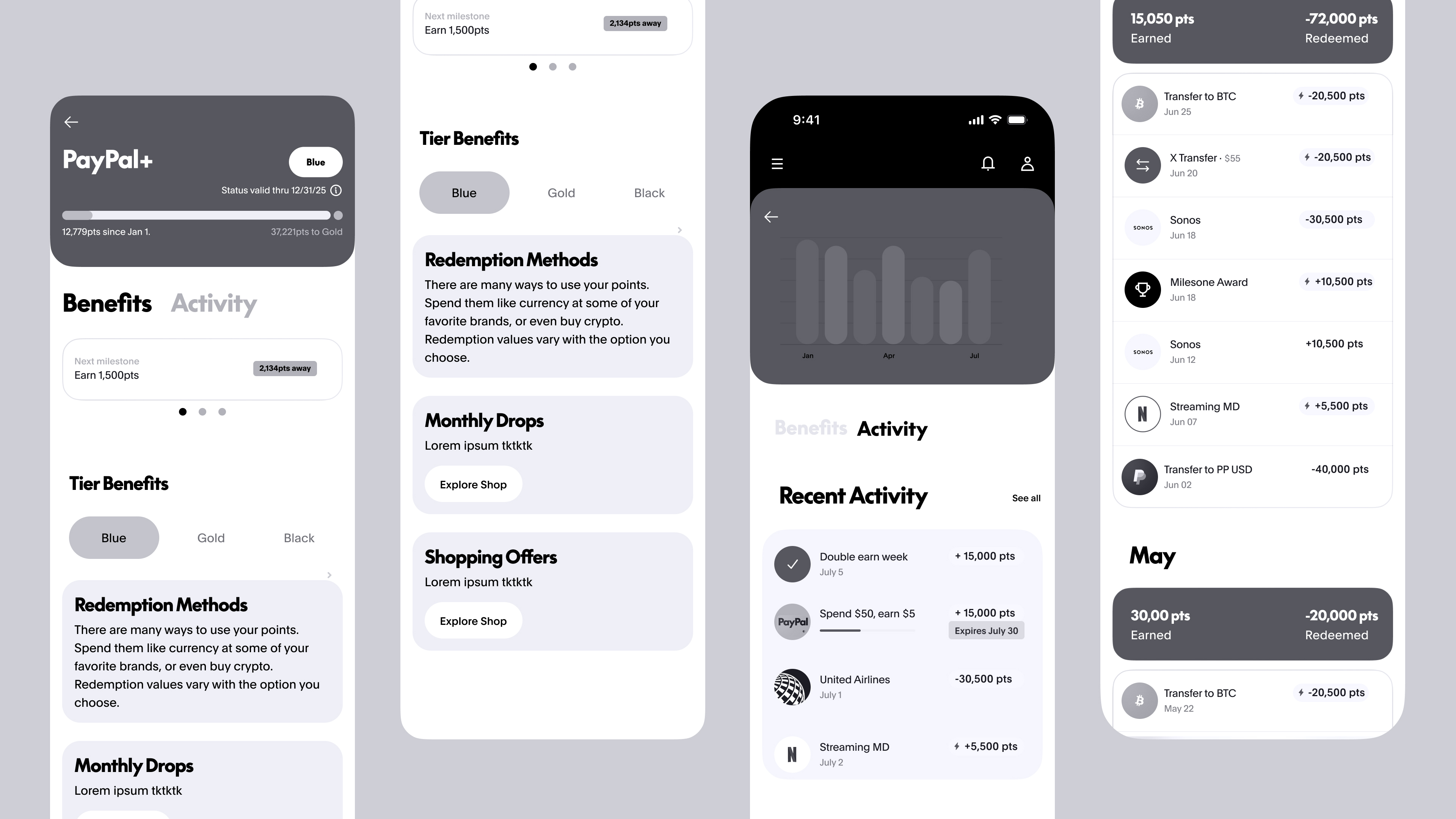
We focused on modular card layouts to ensure scalability and content flexibility.
2. High-Fidelity Visuals
The visual design for the Rewards experience was built on Pentagram’s newly developed PayPal brand identity. Our team translated their brand guidelines into a scalable, product-ready design system:
-
Brand-to-Product Translation: Adapted Pentagram’s bold typography, vibrant palette, and confident layouts into a cohesive UI system optimized for mobile use.
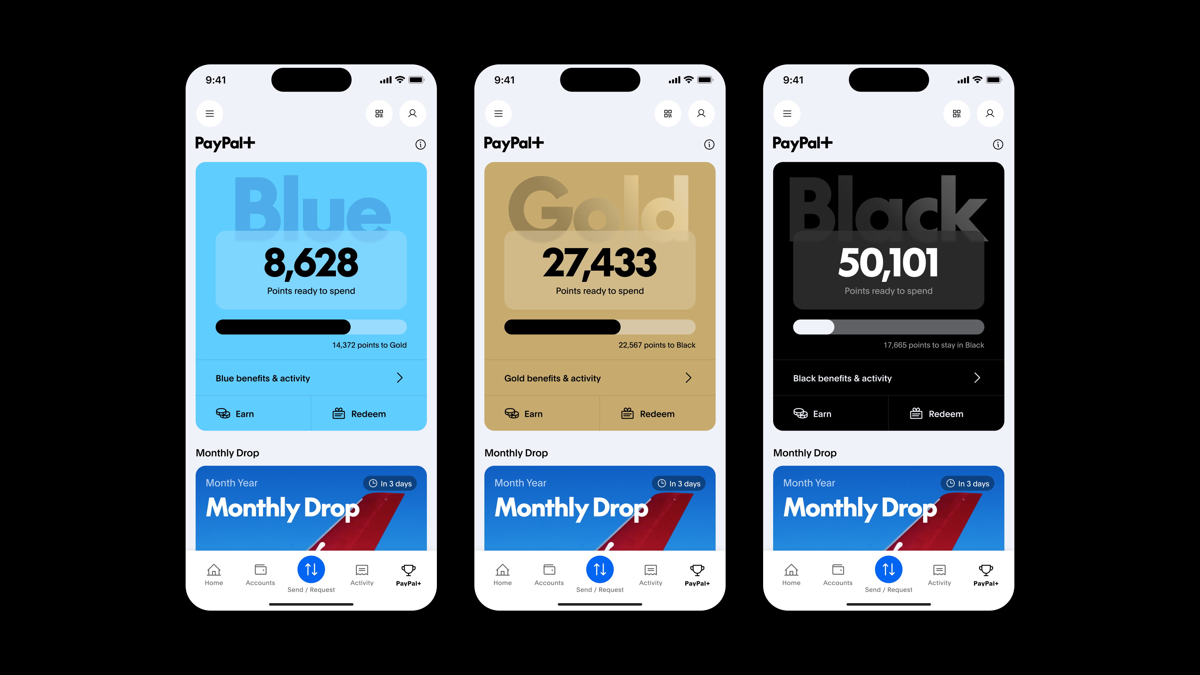
- Tier Differentiation: Blue, Gold, and Black tiers create a clear visual hierarchy and sense of achievement.
- Scalable Card System: Flexible card modules for offers, rewards, and content allowed for easy future growth and campaign integration.
- Modern & Delightful Aesthetic: Elevated PayPal’s positioning from a utilitarian payments tool to a dynamic, trusted financial partner.

This work demonstrates design system thinking—balancing a premium brand vision with accessibility, scalability, and implementation realities.
3. Final UI Evolution
We carefully transitioned from wireframes → mid-fidelity → polished designs:
- Information density reduced cognitive load.
-
Clear visual hierarchy prioritizes key actions (earn, redeem, explore).
- Animation and motion add delight without distraction.